A Progression billboard reading Keep moving forward at a train station

Identity and web

Progression

Context
Progression Physical Therapy, Princeton and Somerville, New Jersey. Freelance
Role
Brand identity, web design, web development
Deliverables
Logo system, brand guidelines, website, design system, social, merchandise

Progression Physical Therapy helps athletes and active adults reach their goals and get their mobility and strength back. I built the brand from the mark up, then the Figma design system behind it, then designed and developed the website on top of that system.

Everything grows from one idea, forward motion: a double chevron mark, heavy extended type and a set of shapes cut from the same angles, in one bright green against black and warm white.
Visit the site ↗

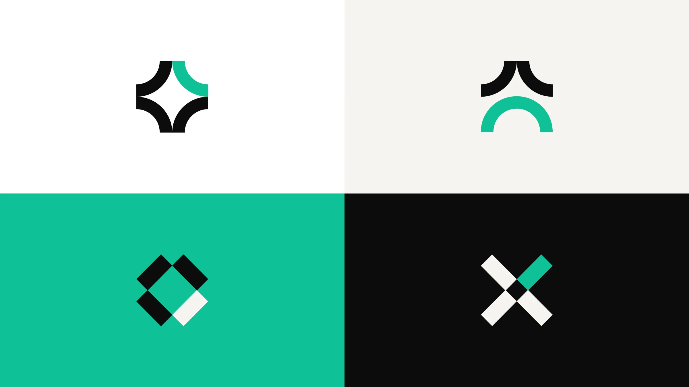
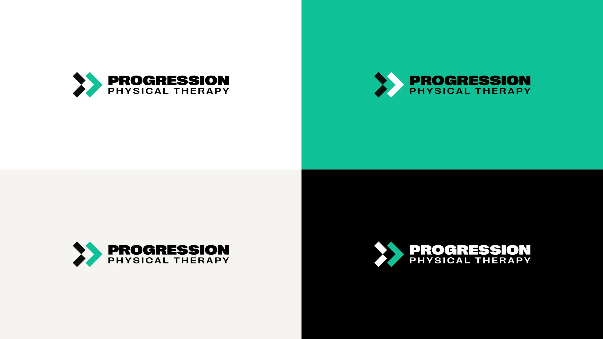
The Progression Physical Therapy logo in four colourways: on white, green, warm white and black
The double chevron mark on black, warm white and white
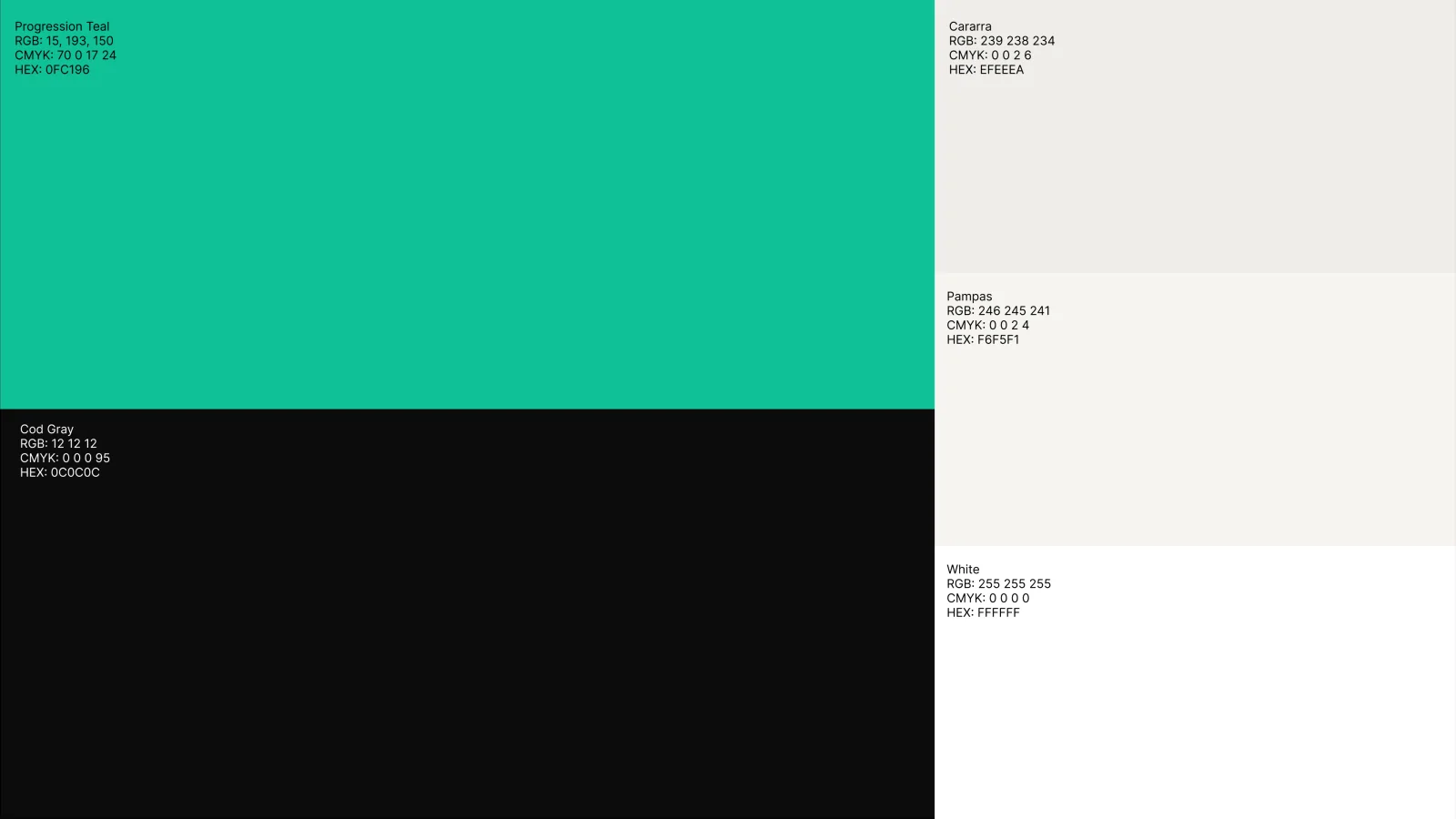
The colour palette: Progression green, black and two warm whites
Four brand shapes built from the chevron angles, in green, black and white
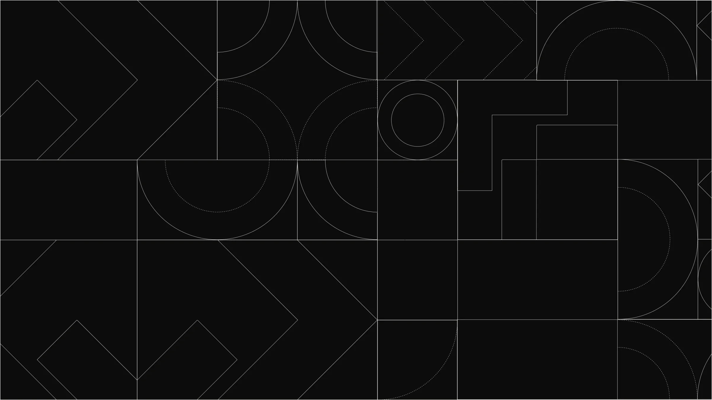
A line pattern made from the brand shapes on black
The shape library, as icons and as pattern

Keep moving forward.

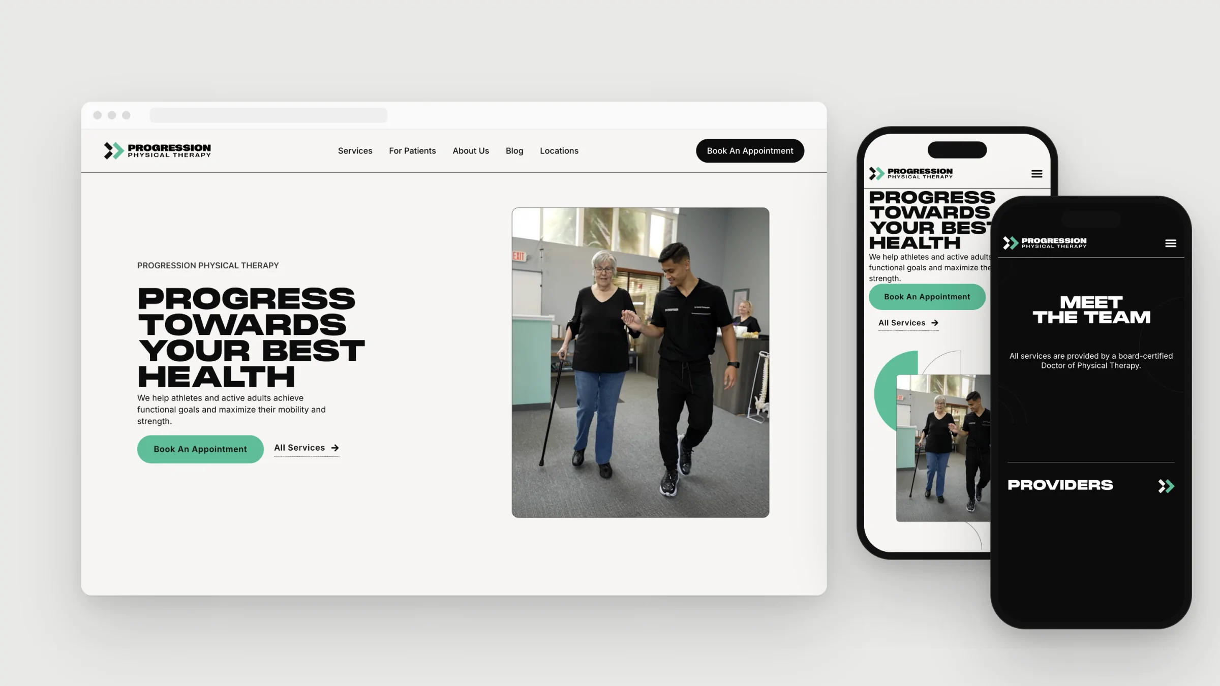
The Progression website on desktop and two phones
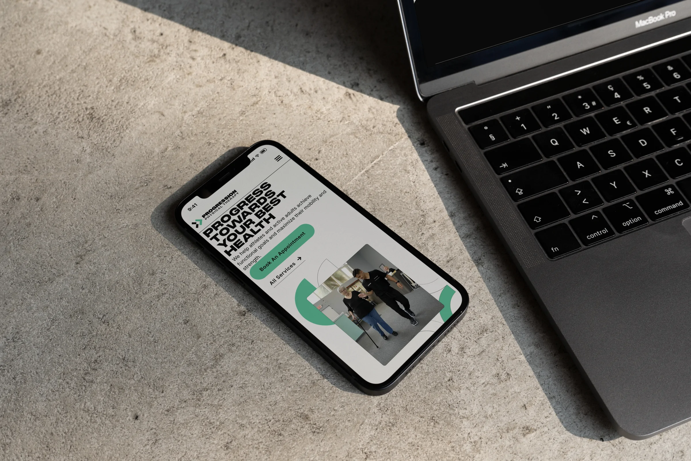
The website on an iPhone beside a MacBook on a concrete surface
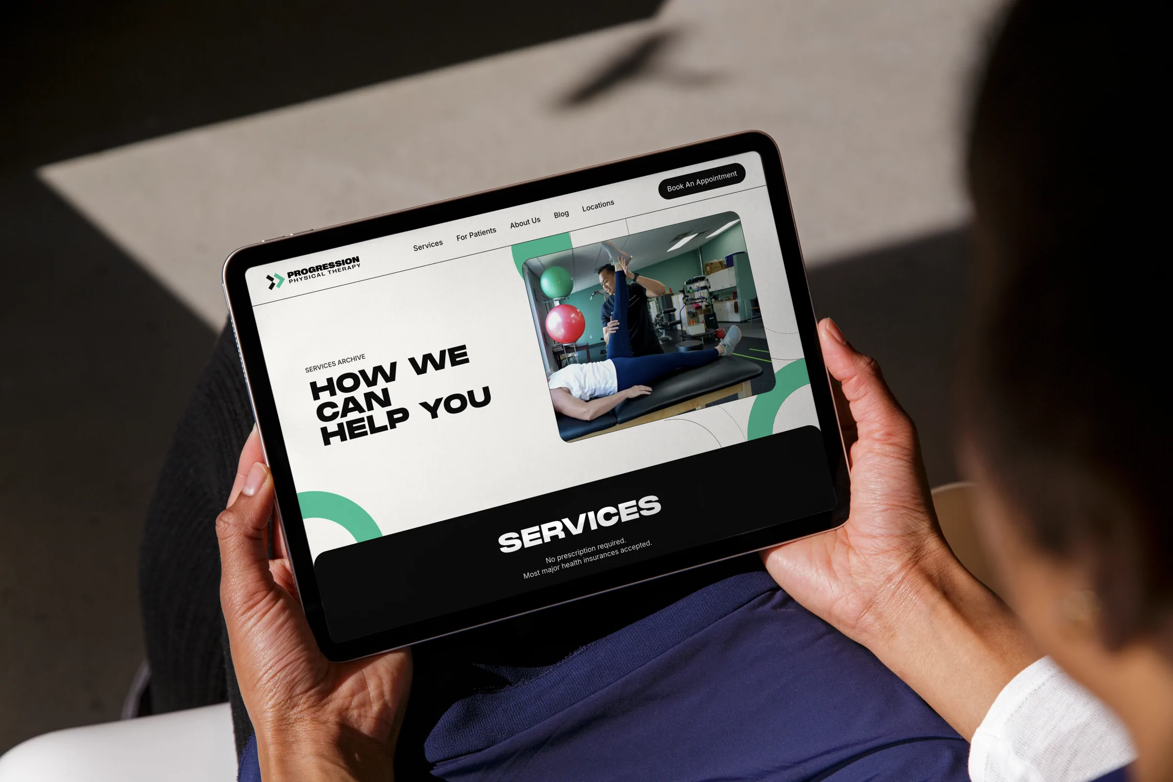
The Services page on an iPad held in someone’s lap
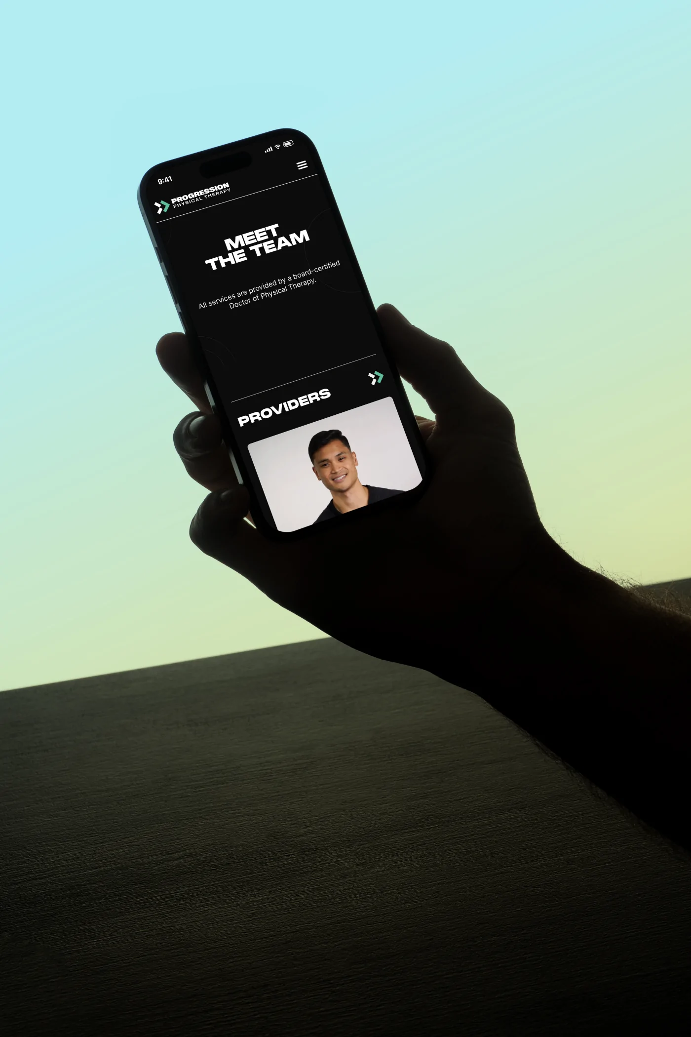
The Meet the team page on a phone held against a soft sky
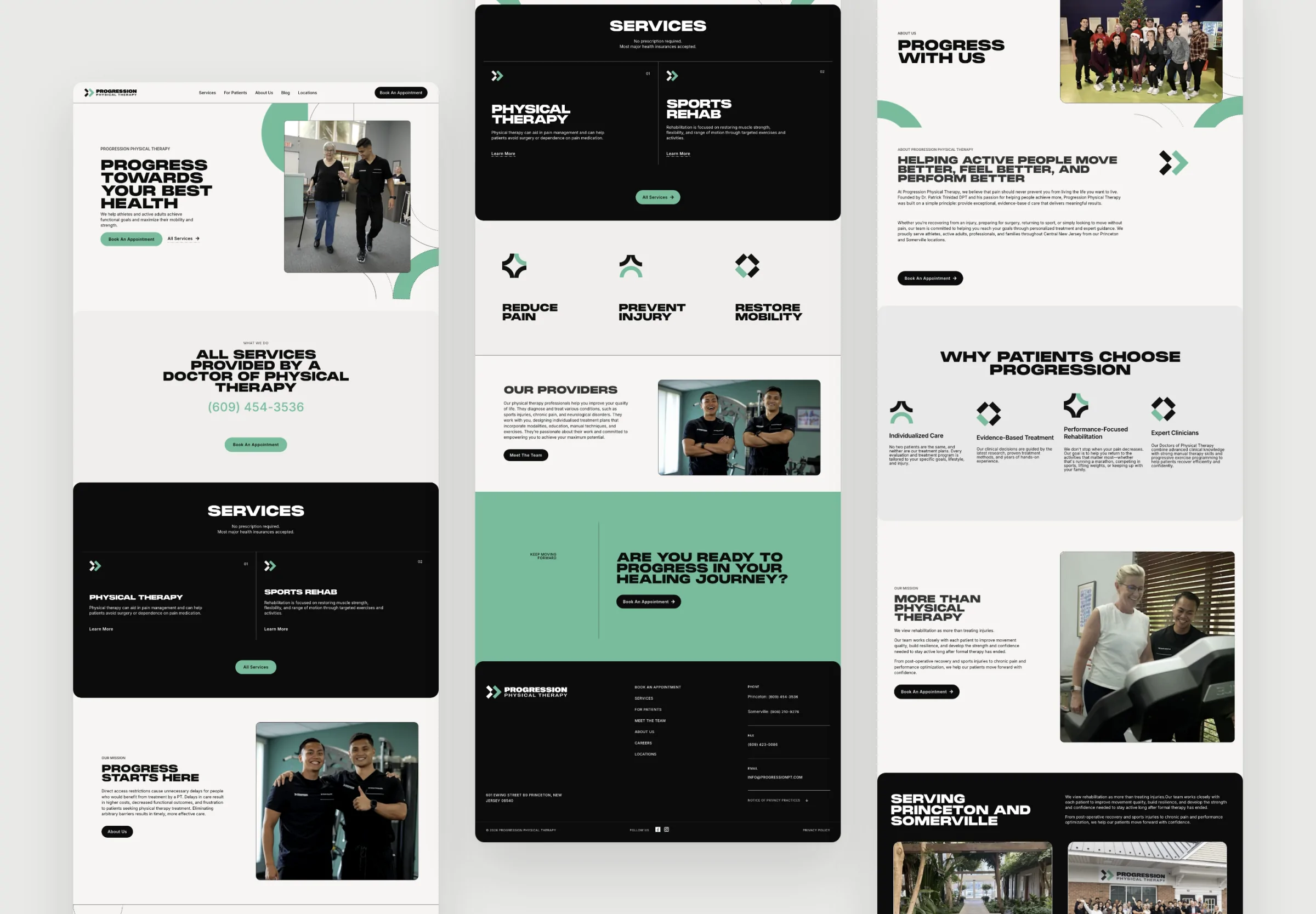
The Home, Services and About pages shown full length side by side
Home, Services and About, designed and built
Three story templates in black, warm white and black
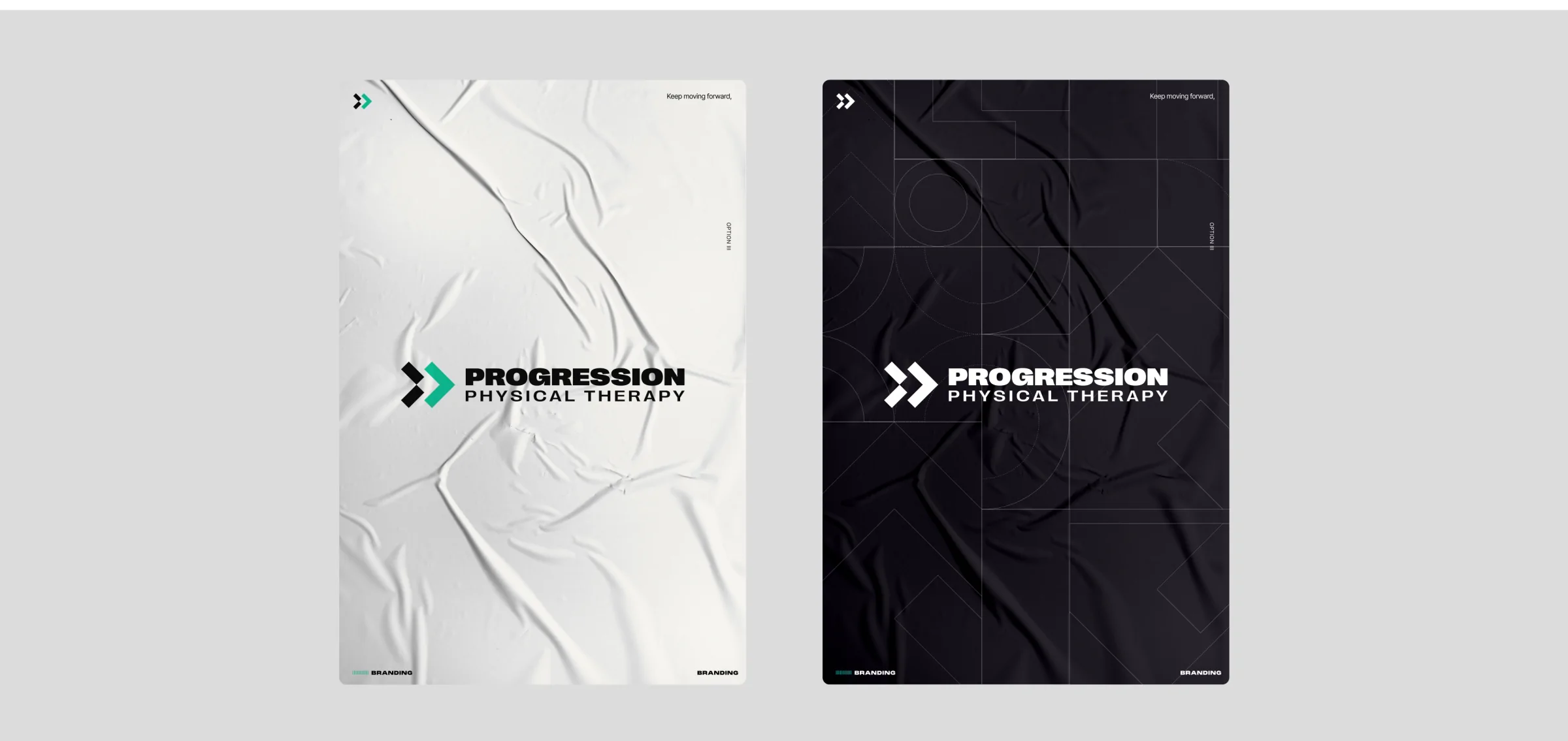
Two pasted posters with the logo, one light and one dark
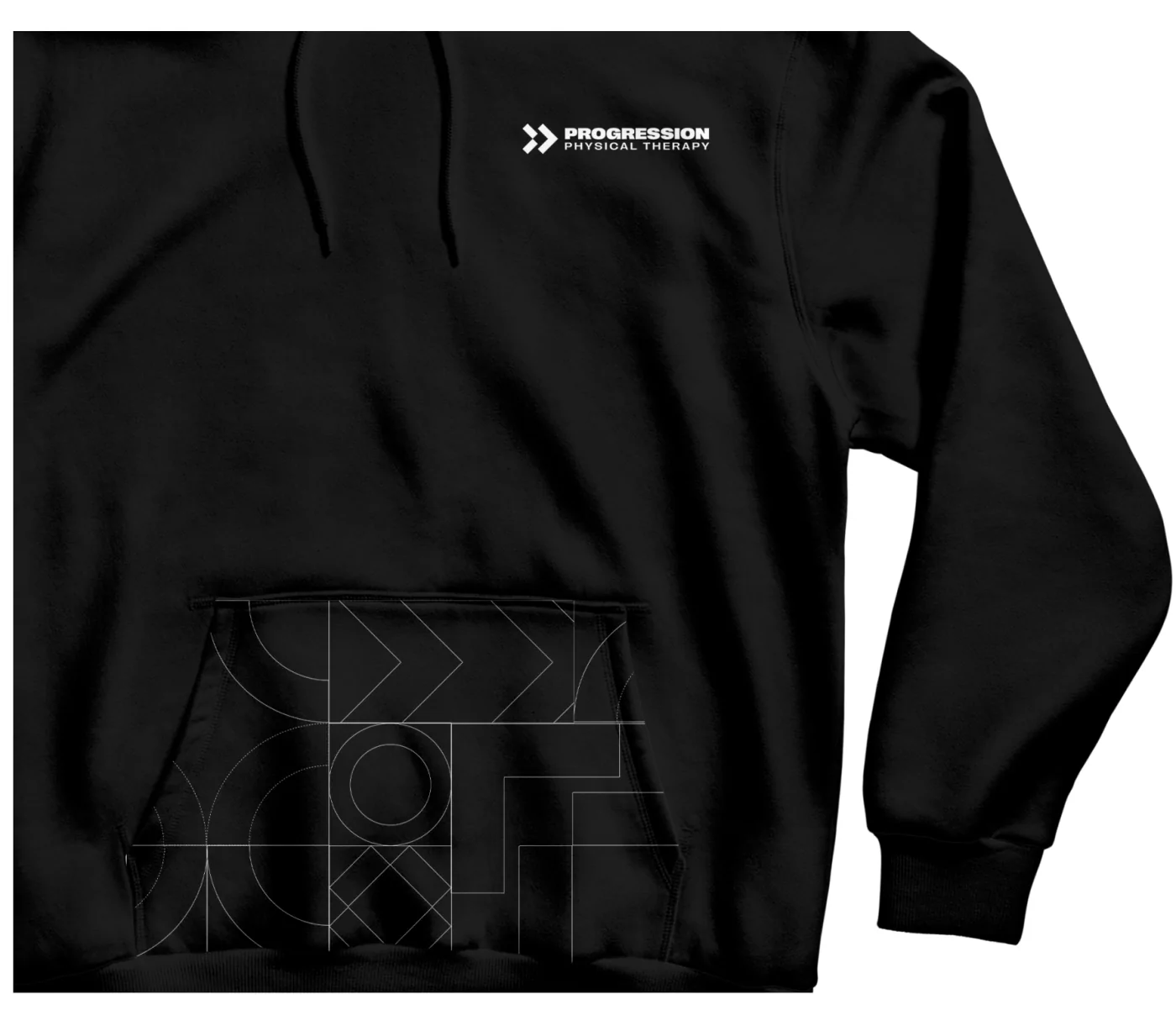
A black hoodie with the logo on the chest and the line pattern on the pocket
A black cap with the chevron mark
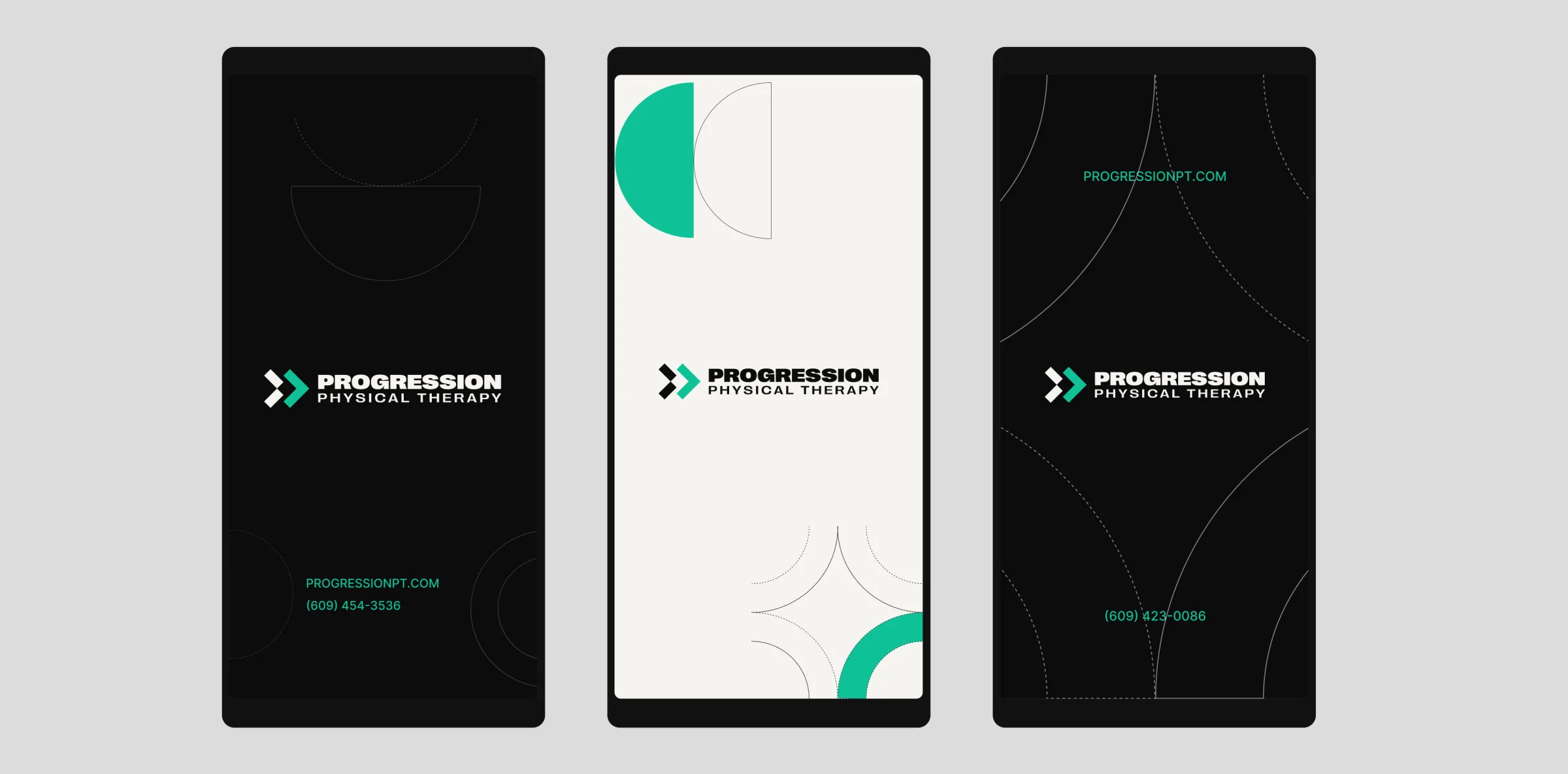
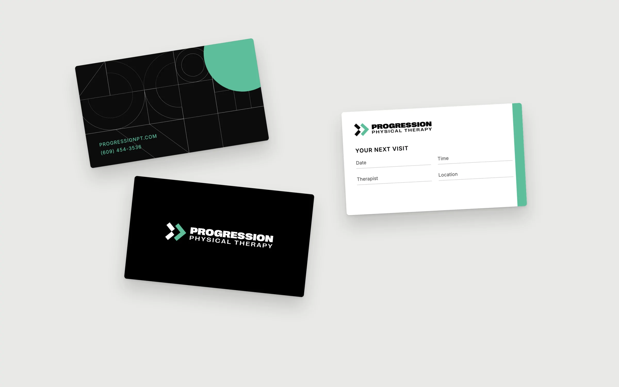
Business cards and an appointment card in black, green and white
New for this case study: business cards and an appointment card, extending the system

Next project

Mood